|
CiA
#59 - score: 7 out of 10
God Among Lice:
CIA seems to be chock-full-o'
photomanip and manippy-design types, which I think is nice.
When these kinds of styles are released by themselves with
mostly airbrush or other traditional scene styles making
up the rest of a pack, I can see how some people might go
and start to believe that it's all the same kind of stuff,
just slapping photos together or something. But when a whole
bunch are presented together like this you get to see all
the many varieties of styles that are possible, many of
them going in quite different directions.
In this pack, you've got the
sort of "pure" photo manipulation of agent 42's Castle Cloud,
almost like a Photoshop tutorial in its mostly straightforward
montaging (and winding up almost as dull as one too). Ghostface's
image of men in winter clothes helping their hobbling friend
out of the desert is less straightforward in both theme
and color. The main difference here is this idea of theme;
it's not just manipulating to create some other image, but
creating a work with an idea/mood/theme by comparing these
different subjects next to each other. Another Ghostface
piece matches a freehand girl with a photographic backdrop
and foreground. In addition, there's a curious silhouetted
jumping man formed entirely by the absence of the scanline
texture of the background... a new effect to me.
Then you have the more abstract
style of montaging such as Fire From Heaven's Construction
series, which itself can have varying degrees of representation
of actual scenes. Agent 42's lie_un presents an image with
just the perfect amount of noise to make us wonder where
the black or the white is really part of the detail, and
where it is simply noise, and made a little more difficult
by inverting one side. Then there's the dramatic made more
dramatic in FFH's sculpture flattened to black, white, red,
and yellow. You find yourself moving between seeing the
splotches of color or tone as depth in the sculpture, and
then seeing them purely as flat color arranged just as themselves
on the plane.
Moving into the design-influenced
pictures, you've got a bluedevil/lk joint with a maniped
photo along with design-aesthetic type and effects spread
all around. Agent 42's Florida Postcard takes this style
a step further by adding a message or concept to the photo-with-design
(though that's not to say the end result is any more effective
aesthetically). Milie's cours de langage plastique is a
great piece of design work and one of my favorites in the
pack. Here the photo has almost disappeared into the world
of large color shapes; it's not very recognizable at first
because of its sideways presentation and false colors. It's
purpose has instead been made completely and solely as a
part of the design. And then finally Agent 42 returns again
with the pure design - no photos - of the Nothing magazine
cover.
I left Ikarus out of the discussion
so far because he seems to fall right smack dab in the middle
of all of these currents. For instance, his Canned Culture
is abstract photo-montage, noise-added, thematic, and design
influenced all at the same time. While he's montaging images,
he's creating a theme as well. While adding to this theme
with words and text, he's creating the design, and eventually
it all comes together as one.
Of course there was more than
just photomanip in this pack. :) Just thought I'd take the
opportunity to try and spell out the many varieties of styles
you can find with photo/manip/design images, and remarkably
even within a single pack such as this. Quickly, some other
images that caught my eye... Sunday's Gimme had a nicely
portrayed lighting effect, and lots of pretty, subtle yellows,
purples, greens, and browns. F7's bear was a menacing counterpart
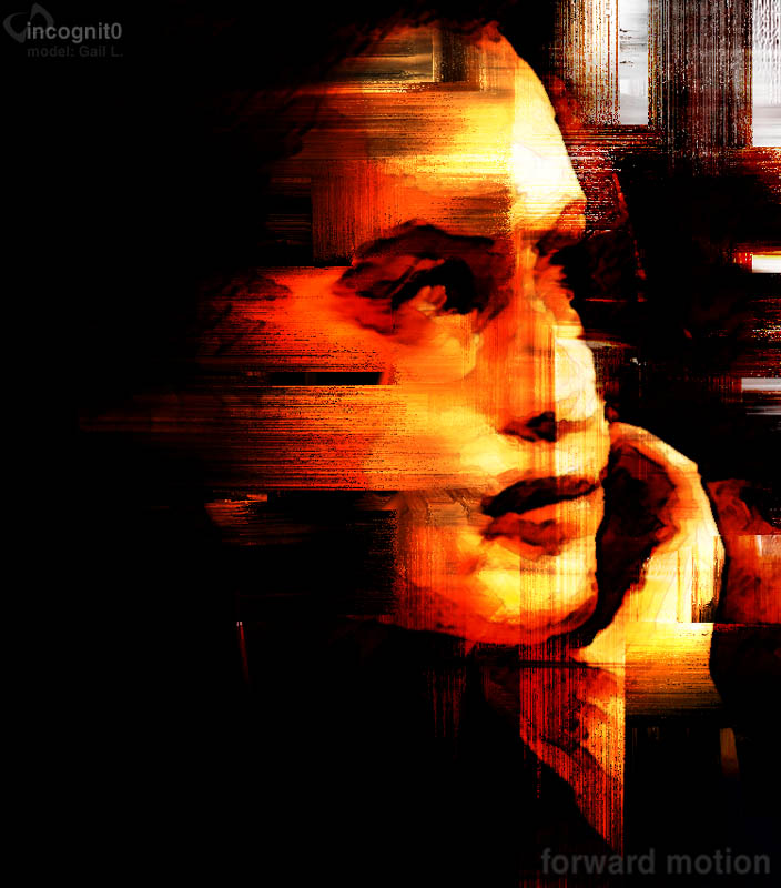
to BD's mountain. I like the smeary brushmarks. Incognit0's
brushy and color-maniped portraits are once again brilliant.
Uhm.. plenty of other images that just seemed so-so to me.
Given the size of this release, it seems like there were
a good number of images that could have been left out to
make this a better pack overall.
score: 7
Root88:
BDF7BE~1.JPG stands out as the best of this pack to me.
It almost looks like a painting traced over a photo, but
I know that Blue Devil and F7 would never do that.
You would think that
Incognito paid me to keep hyping up his work the way I do,
but his images in this pack are fantastic again. HeÆs moved
on from torsos to portraits and they are excellent. Portraits
donÆt hold my attention for too long though, hopefully we
will see the entire package come together in the upcoming
months.
A few tips that might
help out PK_TRPIC.JPG. 1. The girl either has a really small
nose, or it just fell of, it looks a little strange. 2.
There are "jaggies" around the knot of the girls bathing
suit. There are several ways to use anti-aliasing to correct
this. 3. Some parts of the pic seemed blurry. This can be
fine is you are trying to achieve a dreamy type of look,
like they used to get sometimes in the original Star Trek
episodes by smearing Vaseline on the camera lenses. ItÆs
just a bit inconsistent, not a very big deal.
RA_RC.JPG is a good job
of 3d modeling. Only two small problems with this pic. I
think it would look a lot more interesting with something
in the background, instead of just a flat horizon. A giant
construction cone comes to mind. Something to point out
how small the car is supposed to be. The other minute problem
is that the back left tire gets lost in the shadow of the
car. A small adjustment to the lighting of the scene would
quickly correct this.
I just donÆt know SP_FETAL.JPG
is supposed to be. Is it an abstract picture? The title
didnÆt help me identify it either. It looks sort of like
a raised arm with a hand pointing down. Possibly this is
an unfinished pic that snuck into the pack somehow? Maybe
I am just clueless as to what this is, feel free to email
me at root88@ice.org to tell me what a moron I am.
The photomanip artists
in this pack did a little better this month than last month,
but they might be able to learn a thing or two from the
HRG guys.*
*this does not mean
artists should rip others style or ideas.
score: 6.5 if you donÆt
count the fact that itÆs the worst packaged release IÆve
ever seen. (See discussions for numerous reasons why.)

|