|
ACiD
#76 - score: 8 out of 10
Atom:
ACiD 76 I have to say, this was one of ACiD's better packs
of late, with not only a some traditional scene-ish stuff,
but some interesting new things as well.
The pack starts out with two
of madASScow's 3d abstract things. The first one was alright,
but the second one really shines because of the atmosphere
he gave it. It reminds me of the new museum in Bilboa actually.
After madASS's piece, there
is a picture by aXb. I can't say I really like this one
to much, because the photo doesn't blend smoothly with the
drawing, it just looks like two separate layers, which don't
really work together.
Blup has one of his better
pics in this pack, good proportions on the face, and the
hair was well drawn. The rose on the cheek was a nice touch
too. I did notice that her lips were a little lopsided,
but nothing major.
Catbones follows with an add
for acidgear, with a girl wearing a noggin sock. Its well
drawn, really nice skills, but the background looks a little
too filtery, and a little too gray. His next piece was a
bit of a disappointment, as it was really flat and didn't
have to much dimension. He managed to give the dragon a
very slimy/shiny texture, which in a way reminded me of
Grim's older works. Cat's next piece, of a cowboy, was very
nice, it looked like the wild west on, well... acid :).
His fourth (or was that fifth, I can't count :P) wasn't
as good, the face on the right had been filtered.
I believe goat girl makes her
debut in ACiD with her peice of the caveman. I've known
her from #photoshop, so... HI NANCE! :P Her pic was really
photorealistic, awesome technically. The little ACiD on
the fingers was a nice touch, too. Mad skills, though the
hair was a little wirey, but he's a caveman so maybe that
was intentional.
Next is a pic by Grim, which
isn't as good as his latest series with the small figures.
He did tell me that this was just playing around with a
Wacom which he just got, and the textures were really nice,
especially on the face on the bottom. Shading was right
on, too.
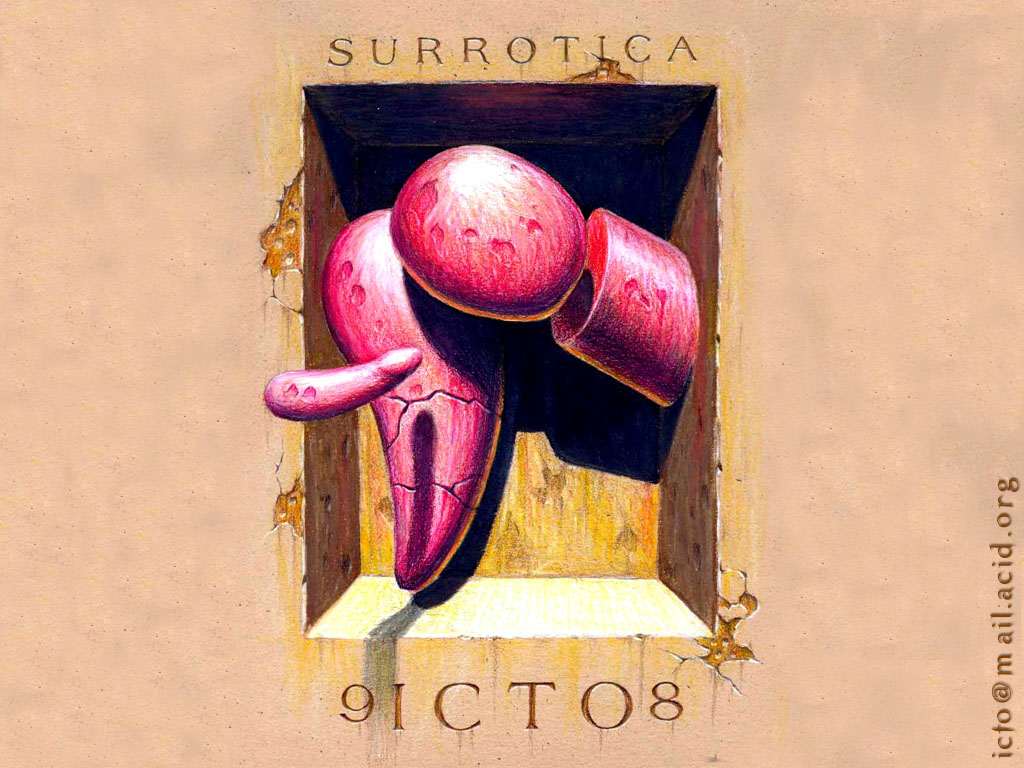
The next pic was by icto, who
I think is a new face in ACiD, or a long idle one. I really
liked this picture. The shading was really cool, and the
shapes, all though a bit phallic, were intriguing. The filth
on the wall was nice, as well.
Jason's pic was different from
his usual stuff, though the background was really nice.
However, the girl wasn't well shaded at all, and she was
missing a nose :)
lk's first pic was interesting,
the charcoal like lines were cool (painter?). The face wasn't
as good, but the lk font at the bottom was really nice.
His next pic was well colored, and for some reason I like
this one. The use of watercolor like textures was good.
lion-gv follows with an ACiD
graffiti thing and a water color like pic. I must say however,
I prefer his designs over these.
optiKnerve's pictures remind
me of Catbones' pic with massive gaussian blur. Nice shading
though, but the bevel on the font wasn't needed, and it
would've been better without the text.
The next picture is a really
nice, bright design by lk and bd, i think. I say i think
because the text was near impossible to make heads or tails
of. I think its for a design division of CiA, but im not
sure. I liked it however, alot.
The next picture, by Tabaqui
wasn't that great. WAY to dark, and very empty.
Tomppa1 follows with a bunch
of his crosshatch pencil pictures, which were shaded in
mute colors. I REALLY like these, all of them were fantastic.
My favorite was the first one, however.
The pack ends with a CD insert
by v3ngance, which is great. It would've been nice without
the long border, and just a strip, but I do realize that
ACiD requires artists to release in perfect proportions,
(640x480, 800x600, etc) which is a stupid rule. I know there's
logic behind it, with certain viewers not being able to
view irregularly sized images, but I have doubts to many
people using viewers like that.
score: 8
Root88:
More abstract 3D stuff from Madass Cow. The work is a little
better this month than last, but it didnÆt interest me very
much. It looks as if he just applied some modifiers to some
simple shapes. In my opinion, itÆs the same as just placing
a bunch of filters on an image in Photoshop.
Blup's pic was technically
fantastic. The idea was a little less than original but
it was very well done. The eyes are hypnotic, and I thought
the rose was a nice touch.
CatBones' dragon pic was another
Grade A pic in AcidÆs release this month. The attention
to detail was amazing. Catbones told me he spent an entire
16 hours on this one. It amazes me that he thought that
was a lot. I guess I work really slowly, but all my pics
usually take that much time. I suppose that after releasing
over 250 pics to our scene, heÆs got his technique perfectly
optimized. Very often people discredit CatÆs work as nothing
but airbrushed skulls. If those people actually looked at
all his pics, they would notice a wide variety of themes,
all done in the Catbones style. There are very few artists
in the scene today that actually create artwork with their
own style. Most are just cheap imitations of others. I find
Catbones style interesting and consistent.
The other Catbones pic that
caught my eye was cat-the_unspoken_word.jpg. Wonderful shading,
as you would expect from him. HeÆs captured a strange combination
of emotions in this one.
Goat GirlÆs pic looks great.
Zoom into 200% and you wonÆt find a single pixel out of
place. The only way I could have thought to improve this
pic would be to color it, but it stands on itÆs own just
fine in black and white.
Acid's new member Icto impersonation
of Salvador Dalí was well executed. I am curious
to find out what tools he made to use this pic. Parts of
the image appear to be done in colored pencil and IÆm not
sure how other parts were done.
Tommpa1 is another scenester
with a unique and interesting style. His perfect control
of fine lines makes me think he could counterfeit a dollar
bill with an ink pen if he wanted to. I only wish he would
put more effort into his work, making larger pics complete
with background.
Vengence is back with another
interesting CD cover. His use of shape and color are attractive
as usual.
score: 8

|