
| Carbon Event | Description |
|---|---|
kEventAccessibleGetChildAtPoint |
Return the "child part" of the view at a particular point on the screen. |
kEventAccessibleGetFocusedChild |
Return which child part of the view currently has the focus. |
Attribute Manipulation
The attribute manipulation Carbon Events are:
| Carbon Event | Description |
|---|---|
kEventAccessibleGetAllAttributeNames |
|
kEventAccessibleGetAllParameterizedAttributeNames |
|
kEventAccessibleGetNamedAttribute |
Return the value for a single accessibility attribute. |
kEventAccessibleSetNamedAttribute |
The counterpart to the previous event. Sets an accessibility attribute to a value. |
kEventAccessibleIsNamedAttributeSettable |
Returns a value indicating whether or not the accessibility attribute is settable. If not, the attribute is read-only. |
Actions
The Carbon Events in the actions group are:
| Carbon Event | Description |
|---|---|
kEventAccessibleGetAllActionNames |
Return a list of "actions" supported by this HIView (or part of the view). The strings returned by this event are not required to be human-readable (though they can be). Like attribute names, action names should not be localized. However, the action descriptions do need to be both human-readable and localized. |
kEventAccessiblePerformNamedAction |
Transmits the user's request from an assistive application (such as VoiceOver), to the application itself. This is how VoiceOver tells the application to perform an action. |
kEventAccessibleGetNamedActionDescription |
Returns a human-readable, localizable description of an action. An assistive application might speak this string to the user. |
Customizing the Application Hierarchy
Now that you have updated your custom HIViews to return accessibility information, it is time to work on your application.
Developers often display a static text control near another control (such as an edit text control) to alert the user to the purpose of the control.
However, a user who is visually impaired may not be able to read the static text control, or may not be able to associate the text with the control.
For example, in Mail's composition window, there is a text field with the word "To:" placed immediately to the left.
Visually, the text field is adorned with a title, but the text field's title is provided by another element.
In this situation, you can use HIObjectSetAuxiliaryAccessibilityAttribute to link a static text control (such as the "To:" label) to another control (such as the text field).
By doing this you are telling VoiceOver, in effect, "this control serves as the title for that control".
Some user interface elements, such as panes that group controls (enabling them to move or resize together, for example) are not interactive,
and have no physical presence on the screen. To the end user, these elements do not exist; they are merely a developer convenience.
If you have controls like this, you should mark them as "ignored" in the AH. Carbon provides the HIObjectSetAccessibilityIgnored attribute
for your use. This prevents VoiceOver from announcing them to the user, thus providing a simpler, less confusing user interface.
If you tell the AH to ignore a control, then the control does not exist in the AH, and the children of the ignored control become children of the
parent control (in the AH).
Note that a customized HIView is ignored by default. In this case you must explicitly set the HIObjectSetAccessibilityIgnored attribute to false
to override this behavior.
The ImageMapView sample demonstrates several aspects of customization:
- It sets the description for the image map, so that the user knows what the image map is representing:
HIObjectSetAuxiliaryAccessibilityAttribute( ..., kAXDescriptionAttribute, ... ); - It marks a static text item as the title of another one, and then tells the static text that it is acting as the title:
HIObjectSetAuxiliaryAccessibilityAttribute ( ..., kAXTitleUIElementAttribute, ... );
and
HIObjectSetAuxiliaryAccessibilityAttribute ( ..., kAXServesAsTitleForUIElementsAttribute, ... ); - It sets description of various sub-elements of the image map:
HIObjectSetAuxiliaryAccessibilityAttribute( ..., kAXDescriptionAttribute, ... );
This cannot be done in the view, because the view doesn't know what the application is trying to represent. - It marks a user pane to be ignored by VoiceOver, since the pane is only used to group other elements:
HIObjectSetAccessibilityIgnored( ..., true );
For the ImageMapView application, that's all we need to do!
Supporting Accessibility for non-HIView User Interface Elements
Even if you are using Carbon Events and HIViews everywhere you can, there is still probably a portion of your user interface where you are not using HIViews. For example, a flowchart application will probably not use HIViews to display and manipulate individual elements in a flow chart. Similarly, a word processing program would not create an HIView for each paragraph, sentence, or word in a document. But that doesn't mean that users don't want to navigate or manipulate those parts of your application.
Apple has provided the AXCanvas example to help you in these types of situations. This example is available in the /Developer/Examples/Accessibility folder.
Exploring the Accessibility Hierarchy
Apple supplies a tool called "Accessibility Inspector", located in the /Developer/Applications/Utilities/Accessibility Tools folder. The Accessibility Inspector displays the AH of the user interface element the mouse is currently over. The display also includes the supported attributes and actions for that UI Element. You can either explore the hierarchy by moving the mouse, or press cmd-F7 to lock the display on a particular element. For example, if you hover the mouse over the green button ("+") in the upper left of any window, you will see a display similar to the following:
<AXApplication: "DragPeeker X">
	<AXWindow: "DragPeeker X">
		<AXButton>

Attributes:
	AXRole:  "AXButton"
	AXRoleDescription:  "zoom button"
	AXSubrole:  "AXZoomButton"
	AXParent:  "<AXWindow: "DragPeeker X">"
	AXWindow:  "<AXWindow: "DragPeeker X">"
	AXTopLevelUIElement:  "<AXWindow: "DragPeeker X">"
	AXPosition:  "x=50 y=26"
	AXSize:  "w=14 h=16"
	AXEnabled:  "true"

Actions:
	AXPress - press
The description tells us where the item lives in the AH, that it is a button control, and a description of what it does. In this case, the "+" button "zooms". If the
user interface element has an AXTitle attribute, it will also be displayed. Note the "+" button does not have this attribute, because it does not have a text
representation of a title.
There is a single action that this button supports—it can be pressed. If you press Cmd-F7 to lock the display, a dialog
appears that lets you explore further, as shown in Figure 1:
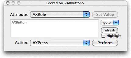
Figure 1: Accessibility Inspector Locked on Dialog
You can look at each of the attributes of the button; if any of them are settable you can set them (note there are no settable attributes for the "+" button). Attributes you can set are marked with "(W)" at the end of the name. You can also navigate the AH from this point, either moving up (to the window or application) or down (to the button's children). If the item supports any actions, you can perform them here—if you click on the Perform button, it will have exactly the same effect as clicking on the button. In this case, the window will zoom. You can navigate up or down the hierarchy using the goto popup menu. An example of this is shown below. Finally, if you click on the "Highlight" checkbox, the area of the screen that the item occupies will be colored a pale red.
Let's look at a more complicated example, from TextEdit. The screenshot in Figure 2 was taken while the mouse was over the Center button in TextEdit's tool bar:
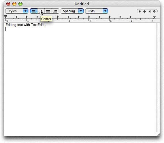
Figure 2: TextEdit Application
Accessibility Inspector displays the following information for the Center button:
<AXApplication: "TextEdit">
	<AXWindow: "Untitled">
		<AXScrollArea>
			<AXRuler>
			 <AXGroup>
				<AXGroup>
					<AXRadioGroup>
						<AXRadioButton>

Attributes:
	AXValue:  "false"
	AXRoleDescription:  "radio button"
	AXParent:  "<AXRadioGroup>"
	AXWindow:  "<AXWindow: "Untitled">"
	AXHelp:  "Center"
	AXSize:  "w=25 h=25"
	AXRole:  "AXRadioButton"
	AXPosition:  "x=249 y=78"
	AXTitle:  "(null)"
	AXEnabled:  "true"
	AXFocused:  "false"
	AXDescription:  "align center"
	AXTopLevelUIElement:  "<AXWindow: "Untitled">"

Actions:
	AXPress - press
As you can see, the segment control identifies itself as a radio button. That is because its behavior is exactly the same as a radio button group—only one item can be selected at once. Clicking on one element in the control causes the other elements to be deselected. Currently, it is not selected (AXValue: false), but it is enabled (AXEnabled: true) and its help text is "Center". The help text appears when the mouse cursor hovers over the element, and it can also be read to the user; it's a bit brief in this example, but much better than nothing. The AXTitle attribute is to be used when the element's title is visually represented with text, for example, an "OK" button. The AXDescription attribute is used when the element's title is not represented visually. For example, the "back" button in a web browser, which is represented visually by an arrow.
TextEdit has a more complicated AH, so there is more here to navigate. Press cmd-F7 to display the Locked on dialog. If you select the goto menu, you can select the parent AXRadioGroup (for example). From there, you can see that the radio group has four children, which is what we expect, given that the segmented control has four options. We can navigate all the way up to the TextEdit application, if we choose.
With the Accessibility Inspector, you can check out your Accessibility Hierarchy and compare it to the on-screen controls. This way, you can be sure that your controls have the correct accessibility information, attributes, and actions.
Apple also provides a tool called "Accessibility Verifier", located in the /Developer/Applications/Utilities/Accessibility Tools folder. The Accessibility Verifier can look at your AH and find common errors, such as missing roles or descriptions. It's quite handy for checking out your AH. However, it finds lots of different errors, including a few that are caused by bugs in the Carbon Toolbox. This sometimes makes it hard to determine which errors are yours, and which ones come from the Carbon Toolbox.
Once you are convinced that your AH is correct, all that is left is to turn on VoiceOver, and try out your application with VoiceOver.
For More Information
- The Accessibility page provides a general overview of Apple's accessibility offerings, with lots of links to more information.
- The Universal Access page provides an end-user oriented overview of the accessibility features in Tiger.
- A Quick Overview of VoiceOver describes the basic features of VoiceOver.
- Guides: Cocoa Accessibility
- An Introduction to Accessibility Programming Guidelines for Carbon
- Universal Access: Computers That Everyone Can Use provides a developer-oriented view of Universal Access.
- Sample Code: User Experience>Accessibility provides example code to help you support accessibility in your applications.
Posted: 2006-06-12
  |
|
Get information on Apple products. Copyright © 2010 Apple Inc. |
|