
| Action | Old Style | New Style |
|---|---|---|
| Define handler | SInt32 ControlDefProcPtr( ) | pascal OSStatus EventHandler( ) |
| Register control | OSStatus RegisterControlDefinition( ) | OSStatus HIObjectRegisterSubclass( ) |
| Create control | ControlRef GetNewControl( ) | OSStatus HIObjectCreate( ) |
Creating a Scrolling Text Window
Use the EmbeddedTextView (4MB) example to work with the finished project. Or, you can create a new Carbon application and open its nib file in Interface Builder, then follow these steps.
Let's create a scrolling text editing window without writing any code.
- In Xcode, double-click your Carbon application's nib file (
main.nib) to launch Interface Builder. - Select your application's main window for editing.
- In the tools palette, select Carbon - Text Based Controls.
- Drag the text view object to your application's window and drop it on. See Figure 1.
- Select the menu item Layout > Embed in > Scroll View. Refer to Figure 2. You will see scroll bar borders appear around the Text View. At this point, you can run the application (Step 9) and experiment with the new functionality, but we will clean up the display a bit first.
- Select Get Info (Command-Shift-I) on the Scroll View.
- Select Size (Command-3). Set the Top/Left x and y values to 0. Back in the window, drag the lower-right edge of the Scroll View (which now contains the Text View) to the lower-right corner of the window. Figure 3 shows the resulting display.
- Select Layout (Command-4). This panel allows you to specify which edges of a control align with the edges of its parent or container. This "binding" relationship updates the physical spacing between parent and child when the user adjusts the window size. Here we want the Scroll View to always fill the window. Bind the Scroll View's edges to the same edges of the parent view: top to top, left to left, etc., as shown in Figure 4.
- Save the nib. Run the application in Xcode. Place the cursor in the main window and start typing. As you type beyond the lower limit of the window, the vertical scrollbar will automatically activate and scroll.

Figure 1: Drag an HITextView onto the Application Main Window

Figure 2: Embed the Text View in a Scroll View

Figure 3: Set the Scroll View Bounds to Match the Window
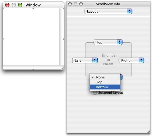
Figure 4: Bind the Scroll View to the Window Edges

Figure 5: Scrolling "Just Works"
The HITextViewShowcase sample code project contains both an Interface Builder example as shown above and a "code-only" version.
Fetching and Displaying an Image
The HIViewDemo (40MB) example
illustrates how standard controls easily coexist and interact
with HIView objects. Figure 6
illustrates the main window layout in Interface Builder. The
button and checkbox are standard control types. The combo box,
two image views, and scroll view are HIView
subclasses. For this example, download
HIViewDemo and work with the finished project. But we will need to write
some code to handle events.

Figure 6: Main Window Layout (Left) and ComboBox Attributes
The ComboBox (type HIComboBox) displays a list of URLs in a dropdown menu. You can also type directly into the edit text field. The right-side of Figure 6 shows the ComboBox attributes. The URLs in the menu are all JPEG images.
Listing 1 contains definitions for various constants and global variables. Note the ControlID values, each containing a control Signature and an item ID. This allows us to identify each control later in the program.
Listing 1: Constant and Global Definitions
enum
{
  kComboBox  = 'CBox',
  kFetchButton = 'Ftch',
  kImage = 'Imge',
  kCheckbox = 'Chck'
};

const ControlID  kComboBoxID = { kComboBox, 0 };
const ControlID  kFetchButtonID = { kFetchButton, 0 };
const ControlID  kImageID = { kImage, 0 };
const ControlID  kImageOverlayID = { kImage, 1 };
const ControlID  kCheckboxID = { kCheckbox, 0 };

WindowRef gMainWindowRef = 0L;
Boolean gOverlayImageIsInited = false;
The Fetch button, when clicked, reads the URL from the text field, then fetches the JPEG image at that URL. Listing 2 shows the registration of the Fetch event handler. The button is currently needed because of a bug in the combo box: pressing Enter after entering text or selecting a menu item does not trigger a unique event. Instead, we make the user press the Fetch button, and then retrieve the URL from the edit text area of the combo box.
Listing 2: Registration of the Button Event Handler
int main( int argc, char* argv[] )
{
    OSStatus err;
    int i = 0;

    EventTypeSpec eventTypes[ 10 ]; // max number of events to register
    ControlRef  control;

    // snip

    // Get the button control
    err = GetControlByID( window, &kFetchButtonID, &control );
    require_noerr( err, CantGetControlByID );

    i = 0;

    eventTypes[ i ].eventClass = kEventClassControl;
    eventTypes[ i ].eventKind = kEventControlHit;

    err = InstallControlEventHandler( control, NewEventHandlerUPP( MyButtonHandler ),
        i + 1, eventTypes, NULL, NULL );

    // snip

CantGetControlByID:
    return err;
}
The retrieved image is used to create a CGImage, which then gets displayed in the scrolling HIImageView. This scrolling image capability is added to the parent window in the same manner as in the previous (text area) example. First, select the Carbon-Enhanced Controls section of the Tools palette. Next, drag a HIImageView object from the palette to the window. Finally, select Layout > Embed in > Scroll View.
The checkbox shows or hides a small overlay image (also an HIImageView) in the upper portion of the larger image. In this example, the overlay is stored locally, but it could have been retrieved remotely. The overlay image itself is not transparent, as can be seen by the pale white background surrounding the text "JPEG Viewer", but the HIImageView containing the overlay image has its alpha (transparency) value set to 0.5, making it semi-transparent, as shown in Figure 7.

Figure 7: Setting the Alpha Value for The Overlay Image
Clicking the Fetch button starts the download and display
process. The event handler for the button first checks the event
type, as shown in Listing 3. A press and
release of the Fetch button constitutes a hit. The
handler first gets the URL text that was entered into the edit
text portion of the combo box by means of the menu or typing.
The URL text is used to create a CFURLRef object
and provider for the image data. Finally, the image itself gets
created. Note that we release the various objects as soon as
possible after use. This includes the image: calling
HIImageViewSetImage copies the image bytes into the
view's private data, so the original reference is no longer
required.
Listing 3: The Button Event Handler
OSStatus MyButtonHandler( EventHandlerCallRef inHandlerCallRef, EventRef inEvent, void *inUserData ) {
    OSStatus status = noErr;
    HIViewRef theView;
    ControlRef theControl;
    UInt32 kind;
    Size size = 512;

    status = GetEventParameter( inEvent, kEventParamDirectObject, typeControlRef, NULL,
        sizeof( ControlRef ), NULL, &theControl );

    kind = GetEventKind( inEvent );

    if ( kind == kEventControlHit ) {
        // Get the combo box control
        status = HIViewFindByID( HIViewGetRoot( gMainWindowRef ), kComboBoxID, &theControl );

        CFStringRef urlString;

        status = GetControlData( theControl, kControlEditTextPart, kControlEditTextCFStringTag,
            sizeof( CFStringRef ), &urlString, &size );

        CFURLRef urlRef = CFURLCreateWithString( kCFAllocatorDefault, urlString, NULL );

        if ( urlRef != NULL ) {
            CGDataProviderRef source = CGDataProviderCreateWithURL( urlRef );

            if ( source != NULL ) {
                CGImageRef image = CGImageCreateWithJPEGDataProvider( source, NULL, false,
                    kCGRenderingIntentDefault );

                if ( image != NULL ) {
                    HIViewRef theImageView;
                    status = HIViewFindByID( HIViewGetRoot( gMainWindowRef ), kImageID,
                        &theImageView );

                    status = HIImageViewSetImage( theImageView, image );

                    CGImageRelease( image );
                }

                CGDataProviderRelease( source );
            }

            CFRelease( urlRef );
        }

        CFRelease( urlString );
Because the overlay image is static, we check a global flag to see whether this is the first fetch, and if so, acquire the image using the same process just described. Note that the URL text is hardcoded at the top of this function. Refer to Listing 4.
Listing 4: Loading the Overlay in the Button Event Handler
        if ( gOverlayImageIsInited == false ) {
            urlRef = CFURLCreateWithString( kCFAllocatorDefault, CFSTR( "file:///caption.jpg" ),
                NULL );

            if ( urlRef != NULL ) {
                CGDataProviderRef source = CGDataProviderCreateWithURL( urlRef );

                if ( source != NULL ) {
                    CGImageRef image = CGImageCreateWithJPEGDataProvider( source, NULL, false,
                        kCGRenderingIntentDefault );

                    status = HIViewFindByID( HIViewGetRoot( gMainWindowRef ), kImageOverlayID,
                        &theView );

                    status = HIImageViewSetImage( theView, image );

                    gOverlayImageIsInited = true;
                    CGImageRelease( image );

                    CGDataProviderRelease( source );
                }

                CFRelease( urlRef );
            }
        }
Next up is the checkbox. In Listing 5, we use standard Control Manager calls to get the reference to the checkbox, though HIViewRef and ControlRef objects are interchangeable because they are the same underlying data type. If the checkbox is checked, then display the overlay image; otherwise, hide it. This listing also contains the close of the event handler.
Listing 5: Handling the Checkbox State
        status = GetControlByID( gMainWindowRef, &kCheckboxID, &theControl );

        SInt32 isChecked = GetControl32BitValue( theControl );

        if ( kControlCheckBoxCheckedValue == isChecked && gOverlayImageIsInited == true ) {
            status = HIViewFindByID( HIViewGetRoot( gMainWindowRef ), kImageOverlayID,
                &theView );

            status = HIViewSetVisible( theView, true );
        }
        else {
            status = HIViewFindByID( HIViewGetRoot( gMainWindowRef ), kImageOverlayID,
                &theView );

            status = HIViewSetVisible( theView, false );
        }
    }

    return status;
}
Figure 8 shows the application when it first launches. No images have been fetched. The horizontal separator across the center of the display area is for aesthetics only, and was added in Interface Builder.

Figure 8: The Running Application
Figure 9 illustrates a retrieved image with the semi-transparent caption overlaid on top.

Figure 9: Overlaying The Caption on the Primary Image
Performance Improvements
Application performance improves most noticeably in redrawing. With compositing enabled in the containing window, the rendering system calculates and redraws the smallest areas possible.
Events dispatched through the Carbon application event loop go directly to their target event handlers, and only registered event types will be sent. Your application no longer needs to provide a centralized event dispatching loop covering all event types. This difference is illustrated in Listing 6.
Listing 6: Classic vs. Carbon Event Handling
From Classic:

void handleEvent( void ) {
    while ( !gDone ) {
        Boolean isEvent = WaitNextEvent(...);

        if ( isEvent ) {
            switch ( event.what ) {
                case nullEvent:
                    break;

                case mouseDown:
                    handleMouseDown();
                    break;

                ...
            }
        }
    }
}

To Carbon:

// Not shown: register desired events for this object.
pascal OSStatus ViewHandler( EventHandlerCallRef inCaller, EventRef inEvent,
    void* inRefcon ) {
    OSStatus result = eventNotHandledErr;
    MyData* myData = ( MyData * )inRefcon;

    switch ( GetEventClass( inEvent ) ) {
        case kEventClassHIObject:
            switch ( GetEventKind( inEvent ) ) {
                case kEventHIObjectConstruct:
                    ...
                    break;

                case kEventHIObjectDestruct:
                    ...
                    break;

                default:
                    break;
            }

            break;
    }

    return result;
}
Layering controls becomes easier and more consistent using HIViews.
The HIEmbedder code sample illustrates layering using a custom subclass that can
hold other views (an embedder). This is illustrated in Listing 7.
Listing 7: Embedding A View During The Initialize Event
    case kEventHIObjectInitialize:
        // snip

        if ( result == noErr ) {
            Rect itemRect = { 20, 20, 40, 220 };
            ControlRef outControl;
            result = CreatePushButtonControl( NULL, &itemRect, CFSTR( "First Button" ),
                &outControl );

            HIViewAddSubview( myData->view, outControl );
        }

        break;
When placed in a scroll view and registered to receive scroll events, the embedder scrolls in reaction to user clicks (Listing 8).
Listing 8: Handling A Scroll Event
    case kEventScrollableScrollTo:
        // We're being asked to scroll, we just do a sanity check and ask for a redraw.
        HIPoint where;
        GetEventParameter( inEvent, kEventParamOrigin, typeHIPoint, NULL, sizeof( where ),
            NULL, &where );

        HIViewSetNeedsDisplay( myData->view, true );

        myData->originPoint.y = ( where.y < 0.0 ) ? 0.0 : where.y;
        HIViewSetBoundsOrigin( mydata->view, 0, myData->originPoint.y );
Drawing occurs in response to the HIViewSetNeedsDisplay call. The code sample HIEmbedder.cp
illustrates the setup that happens before the embedder redraws itself and
its children. Listing 9 includes most of the Draw event handler.
Listing 9: Handling a Draw Event
    // Draw the view.
    case kEventControlDraw:
        CGContextRef context;

        result = GetEventParameter( inEvent, kEventParamCGContextRef, typeCGContextRef,
            NULL, sizeof( context ), NULL, &context );

        if ( result != noErr ) {
            DebugStr( "\pGetEventParameter failed for kEventControlDraw" );
            break;
        }

        HIRect bounds;
        HIViewGetBounds( myData->view, &bounds );

        CGContextSaveGState( context );
        CGAffineTransform transform = CGAffineTransformIdentity;

        // Adjust the transform so the text doesn't draw upside down.
        transform = CGAffineTransformScale( transform, 1, -1 );
        CGContextSetTextMatrix( context, transform );

        // snip (setup)

        // Now that the proper parameters and configurations have been dealt with,
        // let's draw.
        EmbedderViewDrawing( context, &bounds, myData );

        CGContextRestoreGState( context );
        result = noErr;
        break;
Currently only HIImageView provides a transparency property. Other
controls must supply their own implementation. The functions in Listing 10 are part of a
sequence that uses Quartz 2D to provide transparency in a control through
shading. It is called by the kEventControlDraw handler discussed
above.
Listing 10: Handling Transparency In Conjunction With Shading
typedef struct
{
    float    red;
    float    green;
    float    blue;
    float    alpha;
} CGRGB;

OSStatus EmbedderViewDrawing( CGContextRef context, const HIRect * bounds,
    const EmbedderData * myData ) {
    HIRect FullBounds = { {0.0, 0.0}, {1000.0, kEmbedderDefaultHeight} };

    // Alpha shading working only in Panther
    CGRGB inStartColor = {1.0, 0.0, 0.0, 0.8}, inEndColor = {0.0, 0.0, 1.0, 0.8};
    ShadeRectColor( &inStartColor, &inEndColor, &FullBounds, context );

    return noErr;
}

OSStatus ShadeRectColor(
    const CGRGB*    inStartColor,
    const CGRGB*    inEndColor,
    const HIRect*   inRect,
    CGContextRef    inContext )
{
    OSStatus             err = noErr;
    CGColorSpaceRef      colorSpace;
    CGFunctionCallbacks  callbacks = { 0, ColorGradientEvaluate, NULL };
    CGFunctionRef        function;
    CGShadingRef         shading;
    ColorShadeData       data;

    // Warning: this stuff is sitting on the stack.  Be careful if you move
    // the shading code around.
    data.start = *inStartColor;
    data.range.red = inEndColor->red - inStartColor->red;
    data.range.green = inEndColor->green - inStartColor->green;
    data.range.blue = inEndColor->blue - inStartColor->blue;
    data.range.alpha = inEndColor->alpha - inStartColor->alpha;

    CGContextSaveGState( inContext );
    CGContextClipToRect( inContext, *inRect );

    colorSpace = CGColorSpaceCreateDeviceRGB();
    require_action( colorSpace != NULL, CantCreateColorSpace, err = memFullErr );

    function = CGFunctionCreate(
            &data,           // info
            1,               // domainDimension
            NULL,            // input domain NULL == no range clipping
            4,               // rangeDimension,
            NULL,            // output domain NULL == no range clipping
            &callbacks );    // CGFunctionCallbacks
    require_action( function != NULL, CantCreateFunction, err = memFullErr );

    shading = CGShadingCreateAxial(
            colorSpace,
            inRect->origin,  // start
            CGPointMake( CGRectGetMinX( *inRect ), CGRectGetMaxY( *inRect ) ),    // end
            function,
            false,           // extendStart
            false );         // extendEnd
    require_action( colorSpace != NULL, CantCreateShading, err = memFullErr );

    CGContextDrawShading( inContext, shading);

CantCreateFunction:
    CGShadingRelease( shading );

CantCreateShading:
    CGColorSpaceRelease( colorSpace );

CantCreateColorSpace:
    CGContextRestoreGState( inContext );

    return err;
}
Custom Controls
Custom controls may easily be derived from HIObject or HIView by means of subclassing using C. Syntactically this is not the same as subclassing in C++ or another object-oriented language, but it provides similar benefits, notably shared behavior. A derived or custom control inherits functionality from its parent. Your control responds to Carbon Events and can extend or override the parent control's behavior.
The mechanics are straightforward: you provide an event handling function that responds to specific events (several of which are required) and then register your class at runtime. When the application creates an instance of your class, create and initialize events get passed to the instance allowing it to allocate necessary data structures and initialize values. After this, the instance is ready to respond to the control events for which it registered. Destruction of the object sends one more event, allowing your control to clean up.
The HICustomPushButton example contains a simple custom push button control.
A control may create custom data that gets stored with the control instance. Incoming events contain a pointer to this data (as a void *), eliminating the need for you to retain the pointer in your own code. More on this later. Here is the structure definition for this control. Simply retain a reference to the superclass object once it gets created:
typedef struct {
    HIViewRef    view;  // The HIViewRef for our button.
} CustomPushButtonData;
The control class ID identifies the control during registration and creation. Its value may be programmer-defined, but make sure it is unique.
#define kCustomPushButtonClassID CFSTR( "com.apple.sample.dts.HICustomPushButton" )
The control must include an event handler. Note the last argument, which is the pointer to the custom data discussed above.
pascal OSStatus ViewHandler( EventHandlerCallRef inCaller, EventRef inEvent, void* inRefcon );
CFStringRef GetCustomPushButtonClass();
You may find it convenient to register the control using a separate function. See Listing 11. This example contains "boiler plate" code that includes the required events during registration. You always need to handle the kEventHIObjectConstruct/Destruct event types. KEventHIObjectInitialize is optional, and other event types will vary depending on your control. This control handles the drawing, hit testing, and hilite changed events. The sample code contains inline comments that discuss why these events are handled and others are not. Depending on your control type, you might want to add additional event types.
Class registration using HIObjectRegisterSubclass makes this class
available for use, but does not create an instance. The parameters include, in
order: the ID of the class being registered, its parent class ID, options
(currently ignored, but must be 0), the event handler name, the number of events
being handled (the number of entries in the event list), the event list, any
data needed by the event handler (not usually required, but might be useful or
required in some cases; read the API description for more info), and a reference
to the newly created class.
Listing 11: Class Registration
CFStringRef GetCustomPushButtonClass() {
    // The following code is pretty much boiler plate.

    static HIObjectClassRef  theClass;

    if ( theClass == NULL ) {
        static EventTypeSpec kFactoryEvents[] =
        {
            // The next 2 messages are required.

            { kEventClassHIObject, kEventHIObjectConstruct },
            { kEventClassHIObject, kEventHIObjectDestruct },

            // The next 3 messages are the actual minimum messages you need to
            // implement a simple custom push button:

            { kEventClassControl, kEventControlHitTest },
            { kEventClassControl, kEventControlHiliteChanged },
            { kEventClassControl, kEventControlDraw }
        };

        HIObjectRegisterSubclass( kCustomPushButtonClassID, kHIViewClassID, 0, ViewHandler,
            GetEventTypeCount( kFactoryEvents ), kFactoryEvents, 0, &theClass );
    }

    return kCustomPushButtonClassID;
}
The event handler (refer to Listing 12 and following) should be able to process each type of event registered for the class. Note the cast of the void * to the structure type declared for this class.
The construct event must be handled. Here the custom data gets allocated, and then the superclass instance gets stored in the structure's view field. The new pointer must be pushed back into the event before returning. Nothing is lost, since inRefcon had no underlying data coming in to this call, which is the first event dispatched upon object creation.
Note: Do not call CallNextEventHandler during construction or destruction. Your handler is being called directly by the Toolbox, not as part of an event loop. This is not true for kEventHIObjectInitialize or other events.
Object destruction must also be handled. In this control simply deallocate the pointer. Note: your choice of allocation and deallocation methods depends on how you want to handle memory allocation, but they must match (malloc/free, new/delete, NewPtr/DisposePtr).
Listing 12: Handling Events in a Custom Control
pascal OSStatus ViewHandler( EventHandlerCallRef inCaller, EventRef inEvent,
    void* inRefcon ) {
    OSStatus    result = eventNotHandledErr;
    CustomPushButtonData*    myData = ( CustomPushButtonData* )inRefcon;

    switch ( GetEventClass( inEvent ) ) {

        case kEventClassHIObject:

            switch ( GetEventKind( inEvent ) ) {

                case kEventHIObjectConstruct:
                    // Allocate some instance data.
                    myData = ( CustomPushButtonData* ) calloc( 1,
                        sizeof( CustomPushButtonData ) );

                    // Get our superclass instance.
                    HIViewRef epView;
                    GetEventParameter( inEvent, kEventParamHIObjectInstance,
                        typeHIObjectRef, NULL, sizeof( epView ), NULL, &epView );

                    // Remember our superclass in our instance data.
                    myData->view = epView;

                    // Store our instance data into the event.
                    result = SetEventParameter( inEvent, kEventParamHIObjectInstance,
                        typeVoidPtr, sizeof( myData ), &myData );

                    break;

                case kEventHIObjectDestruct:
                    free( myData );
                    result = noErr;
                    break;

                default:
                    break;
            } // End switch ( GetEventKind() )

            break; // End kEventClassHIObject
Also handle the draw, hit test, and hilite changed events (Listing 13):
Listing 13: Handling Events in a Custom Control
        case kEventClassControl:

            switch ( GetEventKind( inEvent ) ) {

                // Draw the view.

                case kEventControlDraw:
                    CGContextRef    context;
                    HIRect          bounds;

                    result = GetEventParameter( inEvent, kEventParamCGContextRef,
                        typeCGContextRef, NULL, sizeof( context ), NULL, &context );

                    if ( result != noErr ) {
                        DebugStr( "\pGetEventParameter failed for kEventControlDraw" );
                        break;
                    }

                    HIViewGetBounds( myData->view, &bounds );

                    if ( ( !IsControlHilited( myData->view ) ) ||
                        ( !IsControlActive( myData->view ) ) )
                        CGContextSetGrayFillColor( context, 0.5, 0.3 );
                    else
                        CGContextSetRGBFillColor( context, 0.1, 0.1, 1.0, 0.3 );

                    CGContextFillRect( context, bounds );
                    result = noErr;
                    break;

                // Determine if a point is in the view.

                case kEventControlHitTest:
                    HIPoint    pt;
                    HIRect    bounds;

                    // The point parameter is in view-local coords.
                    GetEventParameter( inEvent, kEventParamMouseLocation, typeHIPoint,
                        NULL, sizeof( pt ), NULL, &pt );

                    HIViewGetBounds( myData->view, &bounds );

                    if ( CGRectContainsPoint( bounds, pt ) ) {
                        ControlPartCode part = kControlButtonPart;
                        SetEventParameter( inEvent, kEventParamControlPart,
                            typeControlPartCode, sizeof( part ), &part );

                        result = noErr;
                    }

                    break;

                // React to hilite changes by invalidating the view so that
                // it will be redrawn.

                case kEventControlHiliteChanged:
                    HIViewSetNeedsDisplay( myData->view, true );
                    break;

                default:
                    break;
            } // End switch ( GetEventKind() )

            break; // End kEventClassControl:

        default:
            break;
    } // End switch ( GetEventClass() )

    return result;
}
Finally, let's look at how to create an instance (Listing 14). In this code fragment, once the owning window gets created (not shown) an instance of the custom class gets instantiated, positioned in the window's content view, and made visible.
The second parameter to HIObjectCreate is an EventRef,
for use by classes and their superclasses that accept/require params at
construction time. This custom class does not, but others might Refer to the
header info for the control's superclass.
Listing 14: Creating an instance
    WindowRef theWind;

    // Create Window here (not shown).

    HIObjectRef hiObject;
    theStatus = HIObjectCreate( GetCustomPushButtonClass(), 0, &hiObject );

    if ( theStatus != noErr ) {
        DebugStr( "\pHIObjectCreate failed" );
        goto show_the_window;
    }

    // Place the view into the Window content view.
    root = HIViewGetRoot( theWind );
    HIViewFindByID( root, kHIViewWindowContentID, &contentView );
    HIViewAddSubview( contentView, ( HIViewRef )hiObject );

    // Position the view.
    HIViewSetFrame( ( HIViewRef )hiObject, &frame );

    // Views are initially invisible, so make it visible.
    ShowControl( ( HIViewRef )hiObject );
For More Information
- The document Introducing HIView contains additional background material on HIView.
- The Carbon HIToolbox Sample Code page provides code discussed in this article.
- Technical Note TN2074:HIView APIs vs. Control Manager APIs discusses behavioral and API differences between HIView and the Control Manager.
- Technical Q&A QA1210 discusses the minimal set of events to handle when creating a custom push button derived from HIView.
- Technical Q&A QA1324 provides two approaches for programatically creating a scrolling text box for use in compositing windows.
- The header file HIView.h contains function, data type, and constant information.
- Join or search the carbon-dev mailing list.
- The document Handling Carbon Events provides a summary of the Carbon Event Manager.
  |
|
Get information on Apple products. Copyright © 2010 Apple Inc. |
|