 Show All
When you create a chart based on a PivotTable list, the data displayed in the PivotTable list is plotted in the chart. When you change the view of the data in either the PivotTable list or the chart, the other component is dynamically updated to reflect the changes. For example, if you add a field to the row or column area, the chart is updated to reflect the new field as either category or series data. When you filter data in a chart, the data in the PivotTable list is also filtered.
Before you create the chart, be sure to move all the data you want to see in the chart to the row and column areas in your PivotTable list. By default, the data in row fields is displayed as series data in the chart, and the data in column fields is displayed as category data. You must also add at least one total field to the PivotTable list to have the data displayed in the chart. If you add more than one total field, the chart uses the data from the leftmost total field.
To create a chart, use your design program's procedure for adding a control to a Web page. You can select the type of chart you want and change the series data to use the data in column fields, rather than row fields.
The following example shows a chart based on a PivotTable list. The Sum of Sales field displays total sales for each type of product per salesperson. The blue arrow in the Salesperson field label indicates that the field is filtered to display totals for only four of the salespeople.
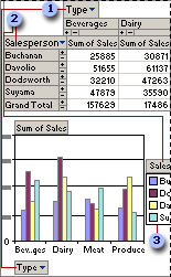
 The PivotTable list column field Type is shown in the chart as category data (Beverages, Dairy, and so on).
 The Salesperson row field is shown in the chart as series data.
 The names of the series are displayed in the legend (Buchanan, Davolio, and so on).
When you add or move fields in the PivotTable list, the chart updates to reflect the changes.
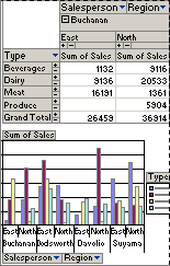
In the preceding example, the Salesperson field was moved to the column area and the Type field was moved to the row area of the PivotTable list. The Region field was added to the column area and filtered to show only East and North. The chart was updated so that the data from the Type field is displayed in the legend as a series, and the data from the Salesperson and Region fields supplies the categories.
You can sort, filter, and move fields within the chart.
 Preparing the PivotTable list