Show All
 For a Column, Bar, Line, Area, Surface or Radar chart
Arrange your data in columns, like this:
| Lorem | Ipsum |
| 1 | 2 |
| 3 | 4 |
or in rows, like this:
| Lorem | 1 | 3 |
| Ipsum | 2 | 4 |

Regular pie charts (like the chart on the right in the example) have only one series of data, so you should use only one column of data. You can also use one column of labels for the data, like this:
| A | 1 |
| B | 2 |
| C | 3 |
or use one row of data, and, if you like, one row of labels:
| A | B | C |
| 1 | 2 | 3 |
Stacked pie charts and doughnut charts can have more than one series of data, so you can use more than one column of data, like this:
| A | 1 | 2 |
| B | 3 | 4 |
| C | 5 | 6 |
or more than one row of data, like this:
| A | B | C |
| 1 | 2 | 3 |
| 4 | 5 | 6 |
For an XY scatter or Bubble chart
Arrange your data in columns, with x values in the first column and corresponding y values and/or bubble size values in adjacent columns, like this:
| X | Y | Bubble |
| 1 | 2 | 3 |
| 4 | 5 | 6 |

Arrange your data in this order: high values, low values, and closing values. Use names or dates as labels, like this:
| Date | High | Low | Close |
| 1/1/2002 | 46.125 | 42 | 44.063 |
Customize your chart as you create it.
 .
.Create a basic chart that you can customize later.
 .
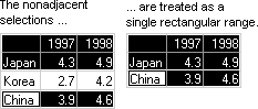
.If the cells you want to select for your chart are not in a continuous range, do the following:
Select the first group of cells that contain the data you want to include. While holding down CTRL, select any additional cell groups you want to include. The nonadjacent selections must form a rectangle.