


TypeStudio
RISCWorld present the TypeStudio manual
Format of text along a path
You will have noticed that when a path is selected the Path option on the main menu becomes ticked and gains a sub-menu. This sub-menu lets you specify how text is to be formatted along the selected path. If you create a path and then move to the sub-menu you will see that the option Size to fit is selected, this is the default, but this option is not always ideal for placing text along a path. Size to fit will adjust the size of the text so that it fits along the length of the path evenly. If one of the other options is selected then the size of the text that is going to be placed along a path becomes very important. The size of text is defined by the Size option on the Text sub-menu. To show how each of the options to format text along a path works we will work through some examples:
Justified text along a path
- Draw a line 10cm long, select it and convert it to a path. Rotate it by 30 degrees using the Rotate option on the Select menu.
- Move to the Path sub-menu and click on Left.
- Select Bookmark.Light as the Font and the Size as 20pt, type the text into the Enter text option and press RETURN or click on OK.
- Repeat steps (2) and (3) changing the option in step (2) to Right and Centre and the text appropriately to get the following:

With each of the justification options the size of the text to be placed along the path is very important. If the size is too large only the text at that size that will fit along the path will be placed along it. For example, if you change the size in the first example to 100pt the result would be as shown on the right above.
If you select Right and a size that is too big the characters that will be missing will be from the left of the text string. If you select Centre and the size is too big then the characters will be missing from both left and right of the text string.
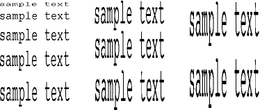
Width to fit
This is similar to Size to fit except that it adjusts the width of the text to fit the path instead of adjusting the overall size of the text. As with other justification options the size of the text is important. If the size of the text is too small and the path too long the characters of the text will be too wide. If the size of the text is too large and the path too short then the characters will be too thin. You will therefore have to experiment with this for any given path. The following shows how this option will transform the same text string along the same path at different sizes for the text:
Upright
This is the last option on the Path sub-menu and is an effect that can be applied to text flowing along paths. The feature keeps the vertical strokes of a character upright whilst the horizontal strokes follow the path as they would normally. It can be used with other options on the Path sub-menu and looks equally good on a straight line or curved path. The illustration shows how Upright can be used along a curved path with the three justification options:
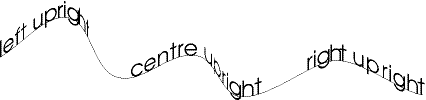
This type of effect is often used on packaging as the text is easier to read when it follows the path but remains upright. Used in conjunction with the Size to fit and Width to fit options it can give impressive results:
When using Upright it is important to note that if the path that the text is applied to curves back under itself the text will be placed along this part of the path back to front.
Example 5 - Text formatted along several paths
- Open a new window to full size and from the Grid sub-menu select the Show and Lock options.
- Using the Line drawing tool draw a box of dimensions 3 x 15cm.
- Draw three further lines 11, 6, and 4cm long. Select all three lines and rotate them by 10 degrees using the Rotate option on the Select sub-menu.
- For the filled corners to the box draw two triangles, with the shortest side being 1cm long and the horizontal side being 5.75cm long. Change the Fill colour of both of the triangles to dark blue.
- Move the 11cm line onto the box and with it still selected click MENU. Click on Path with ADJUST, move to the right of the Path option and choose Left with ADJUST and Upright with SELECT.
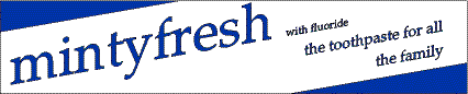
- Open the main menu again and from the Text sub-menu choose the font Paladin.Roman and the Size as 50pt. Enter 'mintyfresh' and press RETURN or click on OK.
- Change the format option on the Path sub-menu to Right by clicking ADJUST on it, then from the Text sub-menu choose Size of 10pt and enter the text 'with fluoride'. Ensure the same path is selected as in point (6) and click on OK or press RETURN.
- Select the 6cm line and change it into a path, move it onto the box. Choose Size as 14pt and enter the text 'the toothpaste for all'. Upright and Right justification should still be selected.
- Repeat point (8) for the 4cm line using the text 'the family'. Ensure that the lines are equally spaced vertically and that they end on the same vertical grid line when you move them onto the box.
- Remove the paths, group the remaining objects and save your work
Suggestions for experimentation
- If you have not tried justifying text along a path with different sizes of text as described in the preceding section then it is recommended that you try each of the options not used in the example i.e. Centre and Width to fit.
- Try the formatting options with curved lines. To extend the example above you could have the product name following the top of a wave shape, with smaller wave shapes for the other text. You could combine text placed along a curved line with text placed along straight line paths. You may have to reduce the size of the product name text to incorporate a wave shape on the narrow box.
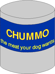
- The idea of placing text on packaging can be extended to the curved surface of a tin or bottle. You can simulate the three dimensional effect of text on a tin by drawing a curved path and applying text to it with Upright selected. Either draw the path to be smaller than the width of the tin and use the Size to fit option, or use the Centre option and experiment with the size of the text you can place along the path you have drawn. The drawing can be finished off by drawing a tin or bottle for the design to go on.
Further ideas using paths and moulds
Expanding the ideas from previous examples we can produce some interesting effects. All the examples are supplied on the CD. A detailed set of instructions for producing them are not provided, but each example is followed by a short description of how the effect was produced and suggestions for extending the idea shown in the example.

This example was produced using two moulds. Each mould is made up of a pair of straight lines with the bottom line being longer than the top and positioned centrally below it. This idea can be extended by increasing the difference in the length of the two lines. Alternatively, if several lines of text are to be represented in this way an interesting effect can be produced by increasing the vertical spacing of the lines that make up the moulds to give the appearance of the text starting in the distance and getting closer.
Moulding can be used to good effect if two or more moulds are applied to the same piece of text. In the logo shown below the first three letters and the last three letters have been moulded separately with the middle letter transformed and scaled to fit. This process of splitting a text string into portions which are moulded separately can give good results especially when the moulds are symmetrical. The idea can be taken one stage further by moulding each character of a text string. This almost creates a new typeface, and although it is time consuming the effect can be worth the effort.

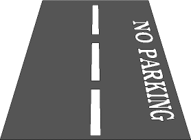
Using moulds can create the effect of distance. The example below was produced by drawing the objects to make up the road, transforming the text without having a mould selected and then grouping all the objects together. A wedge shaped mould was produced and the grouped object moulded to it. After moulding the object was rotated by -90 degrees. This method can be used on any object to give a sense of distance. It is possible to mould several objects separately with the same mould so that they could be used together to give perspective to a drawing. Areas for experimentation include modifying the mould to give varying amounts of perspective and application of this type of mould to other Draw objects that can be drawn or imported into TypeStudio.
This effect was produced using a path and two moulds. The path was used to place the diamonds around the text in a circle and the two moulds to mould the text to fit inside the circle. The character used along the path is available in the font SymbolB. There are many others that can be used from this font. To get the character you have to type in the ASCII code for the character on the numeric keypad whilst holding down the ALT key. A table of the characters and their codes can be found in Appendix B.

From the Font option on the Text sub-menu choose SymbolB. Go to the Enter text option and holding down the ALT key type on the numeric keypad 224 and the diamond shape will appear. The character used for the path could be any character or pair of characters. Instead of using the circle for decorative purposes text could be placed along it, giving information about the design award. The circle could be replaced with a semicircular path and the text centred along it, the text below might then look better of it was not moulded but scaled to fit inside the semicircle.
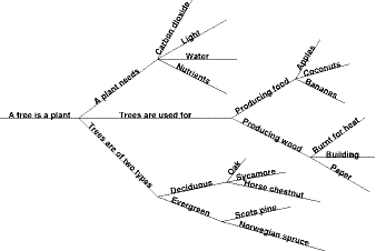
In this final example, several paths have been used to display information. The information is arranged so that it becomes more and more specific as you move along a path. This method for arranging information is very useful, it provides an interesting method of gathering and sorting data and encourages learning since the act of classifying information aids retention as does a visual approach to displaying facts. This type of structure can be produced for virtually any group of related facts and the contents of each path could be supplemented with graphics.
RISCWorld